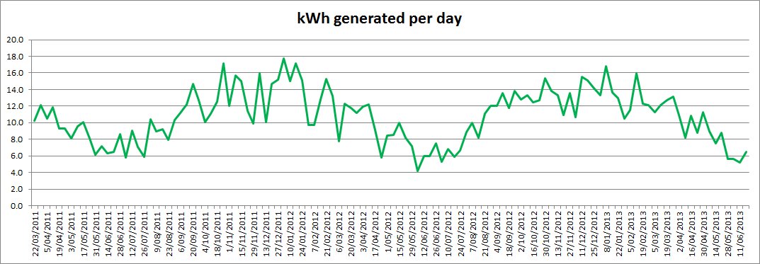
In anticipation of the southern hemisphere winter solstice 2013 that will happen Friday this week, I thought I’d post a nice sun related graph. This graph shows the average power generated by my rooftop photovoltaic solar panels over the course of two and a bit years. It’s interesting to see that despite some quite large week to week variations, the general trend is clearly in line with the seasons, with the peaks and troughs lining up with the summer and winter solstices.
Click on the image to get a larger view.


