
For years I have been receiving a CNET Daily News e-mail newsletter . Despite it’s US-centric view of the world, and slight obsession with reporting on Apple stories, it has been occasionally useful in alerting me to relevant IT and tech stories I might not otherwise have seen.
Recently they updated their newsletter format to a less cluttered layout with more white space and larger images. But in my view the new layout is fundamentally broken, and this is exemplified by the image below where I’m viewing a newsletter in my e-mail client.
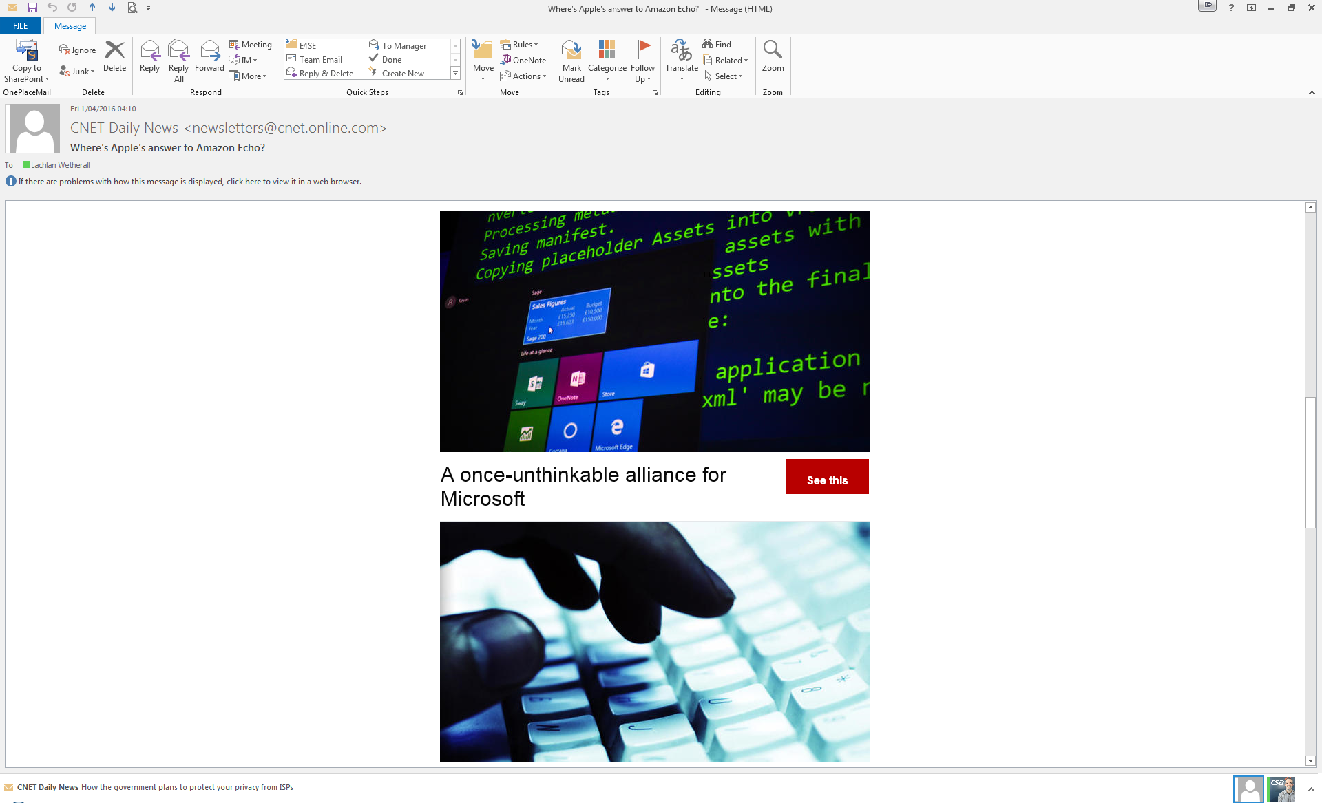
CNET’s new and worthless newsletter layout.
Assuming that the intent of a newsletter is to convey new, how is CNET doing? My monitor resolution is 1920×1200, giving me 2304000 pixels. And what does CNET do with those 2.3 million pixels? They show masses of empty white space, two meaningless, generic and over-large images, and just six words of actual news content! (Or only five words if you count ‘once-unthinkable’ as a single compound word.)
And those six (five) words don’t even convey what the story is about!
There’s room for improvement here – approximately 2.3 million pixels worth of room.