Apple has released iTunes 11 and are loudly proclaiming it as “simpler”, “easier” and “more intuitive. Is it?
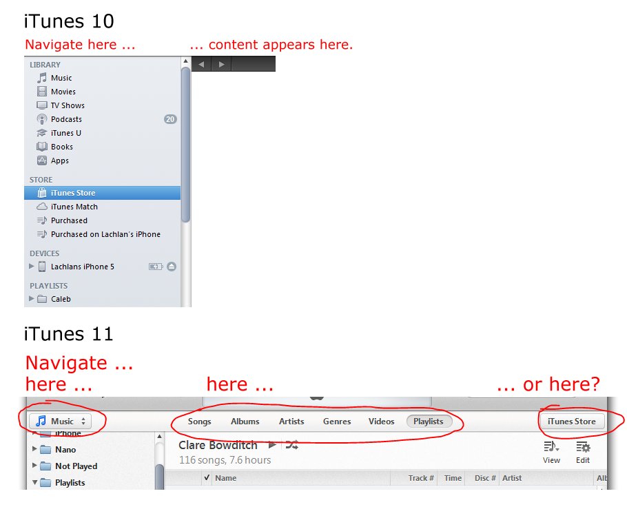
No. Just one example in the screenshot below. In iTunes 10 there was one place (the left panel) where you could find everything you wanted (iTunes store, podcast lists, device sync screen, playlists etc.)
In iTunes 11 there are three different spots you have to go to depending on what you want, and then after navigating to that spot there may be additional clicks to get to the view that you want.
[This content was originally posted to Google+]

